
BeHerd is an interactive website game developed as a group project in partnership with YWCA Amend Together, aimed at helping teenage boys navigate and express their emotions in healthy ways. I contributed to the project by focusing on UX prototyping, designing intuitive user flows and interactive elements to ensure the game was engaging, accessible, and easy to navigate. Through wire framing and high-fidelity Figma prototypes, I helped translate the team’s concepts into a cohesive digital experience that balances education, interactivity, and user-centered design. This project highlights my ability to apply UX principles in a collaborative, socially impactful context. This project won a Gold ADDY Award in 2025.
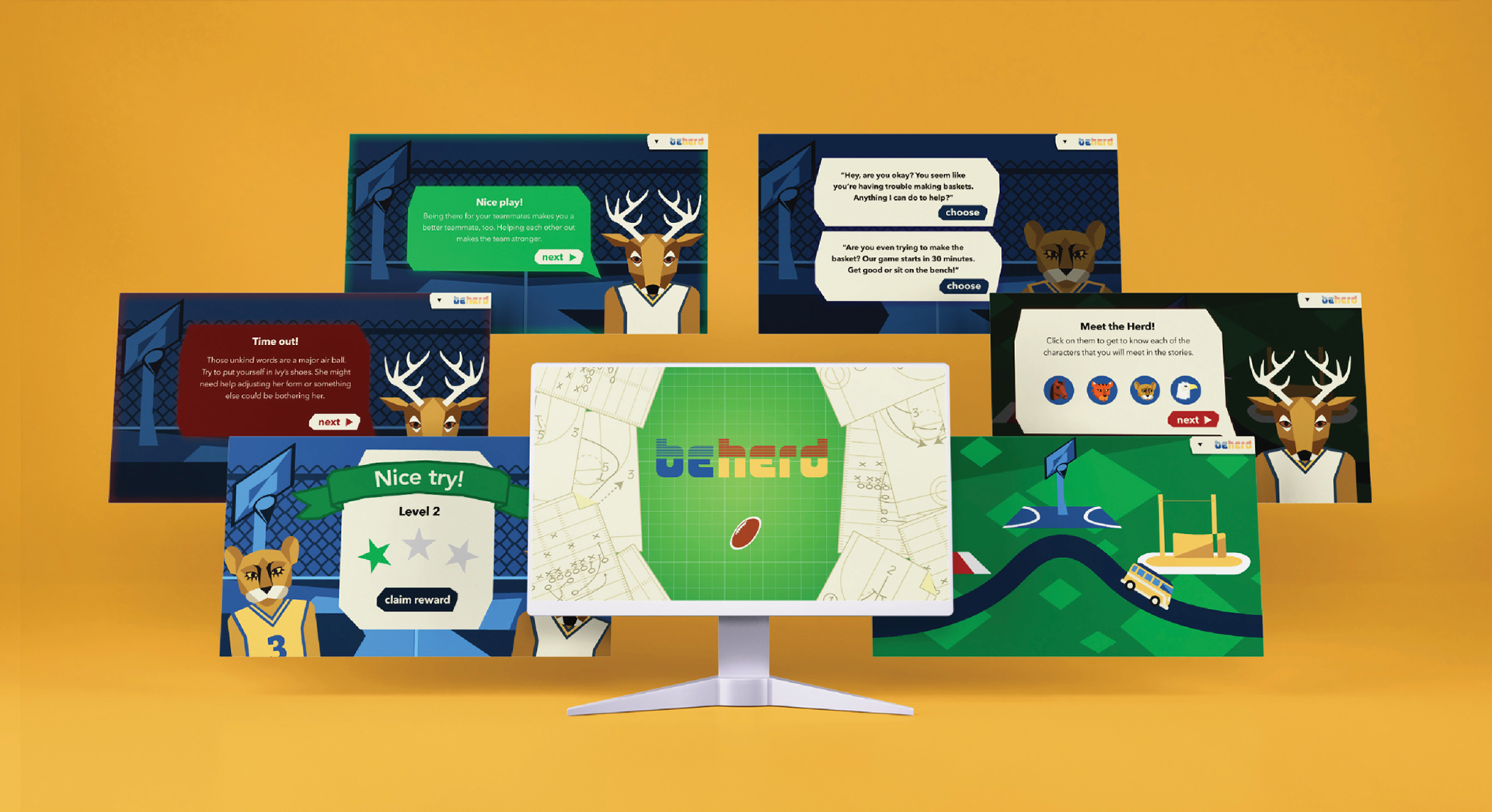
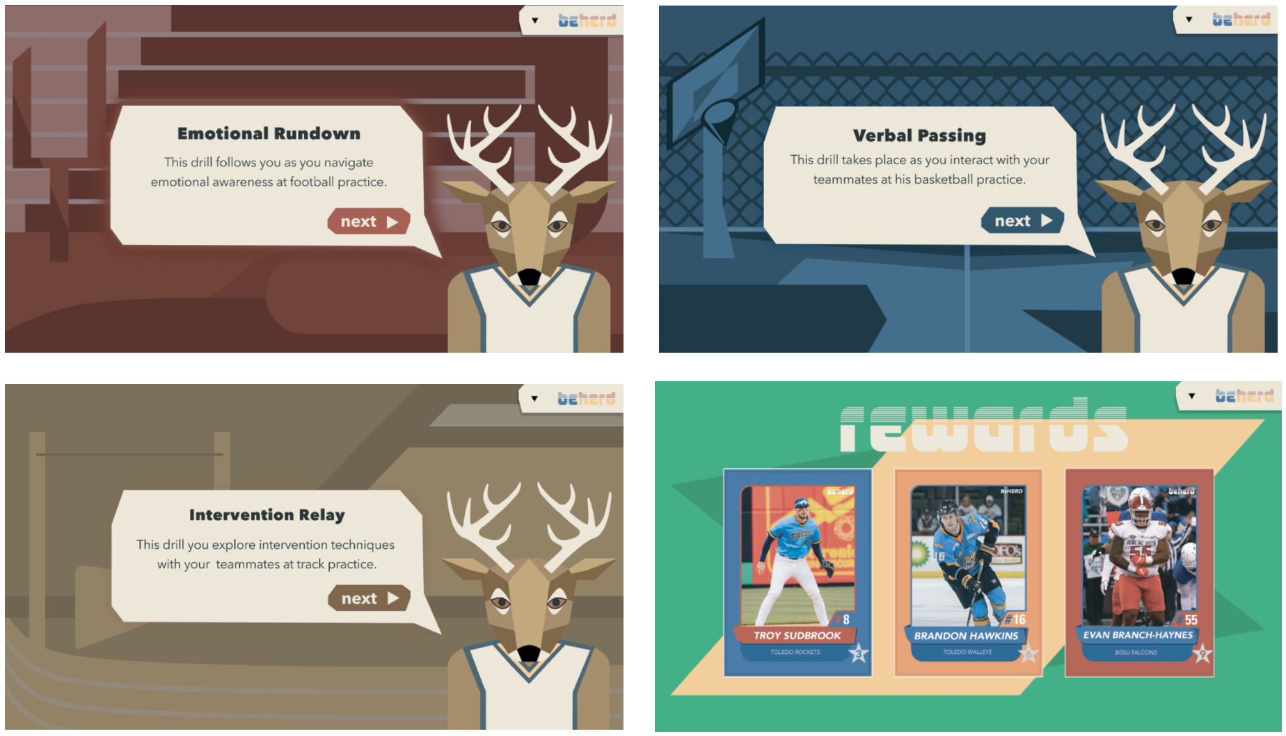
Beyond its interactive design, BeHerd was intentionally created to support teenage boys in building emotional awareness and confidence in expressing themselves—skills that are often overlooked or discouraged. The game uses guided scenarios, relatable storytelling, and choice-based interactions to help users identify emotions, understand their responses, and practice healthier ways of communicating. Each element was designed to feel approachable rather than instructional, reducing stigma and making it easier for users to engage with sensitive topics. By incorporating positive reinforcement, reflection moments, and realistic social situations, the experience encourages players to think critically about their feelings while developing empathy and emotional regulation. Through these design choices, the project not only educates but actively empowers young users with tools they can apply in their everyday lives.
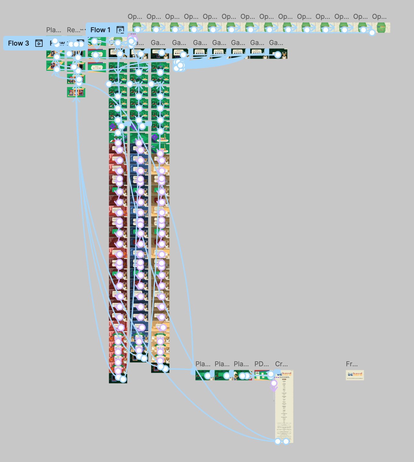
In developing the UX for BeHerd, I focused on creating a seamless and intuitive experience that would keep users engaged while navigating sensitive content. I mapped out user flows to ensure that each interaction felt natural and purposeful, minimizing confusion and cognitive overload. Through wireframing and iterative prototyping in Figma, I explored layout, navigation patterns, and interactive elements that would be both visually appealing and easy to use for a younger audience. I also prioritized accessibility and clarity, using consistent visual cues, simple language, and responsive design choices to guide users through the experience. By continuously refining these elements, I helped shape a user-centered interface that supports both engagement and emotional learning.