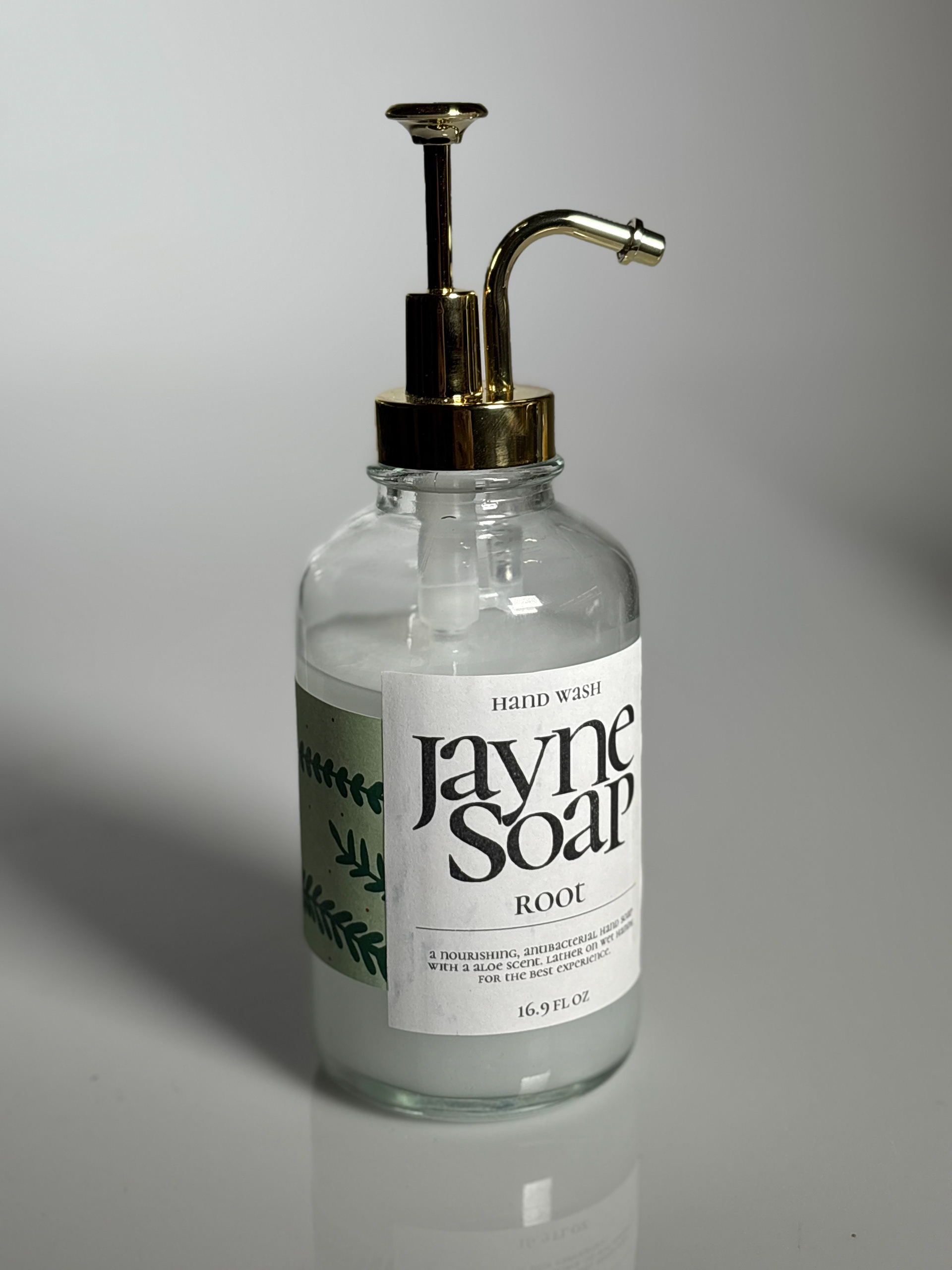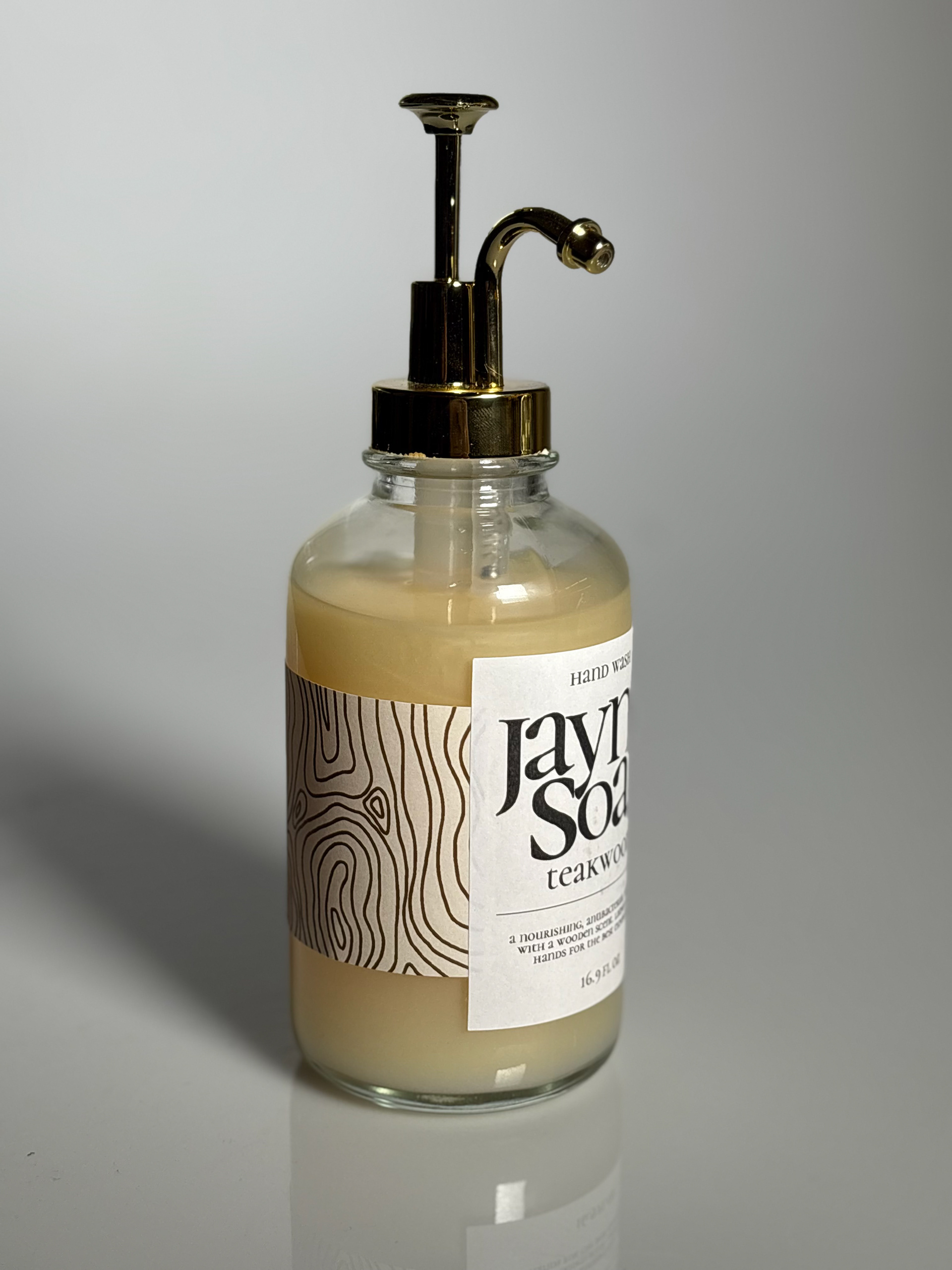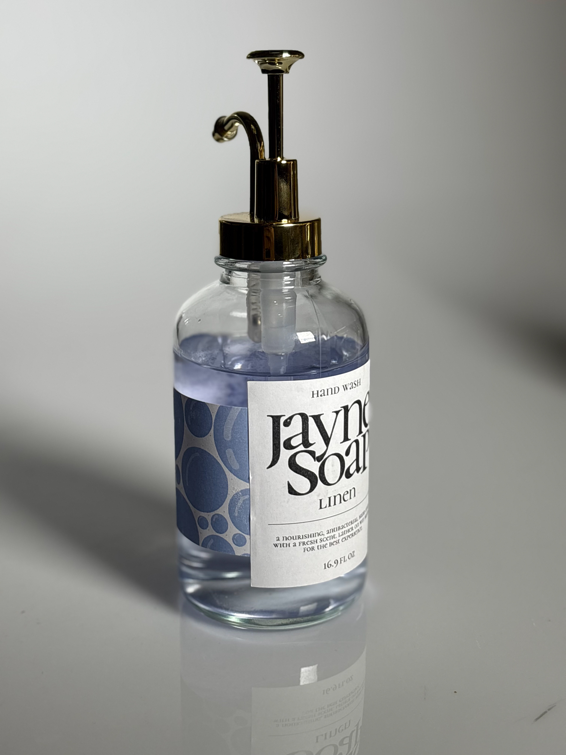
Jayne Soaps is a packaging design project that explores the balance between elevated aesthetics and playful personality within a functional product. The design reimagines the traditional soap bottle through refined typography, a clean structural form, and a soft, modern color palette, while incorporating subtle, whimsical details that add character and approachability. By blending sophistication with a sense of fun, the packaging appeals to a wide audience, transforming an everyday item into a visually engaging and memorable experience that stands out on the shelf.
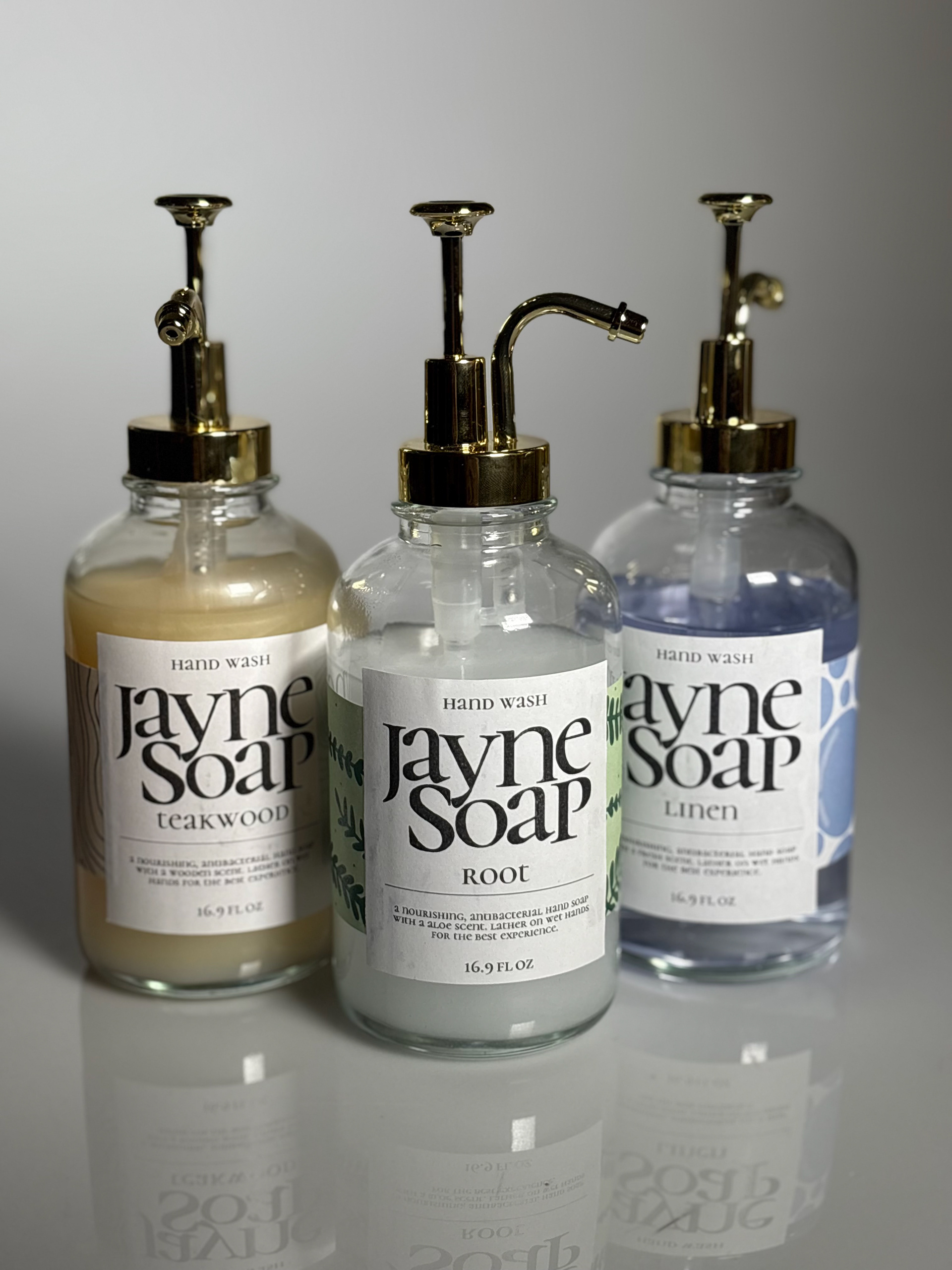
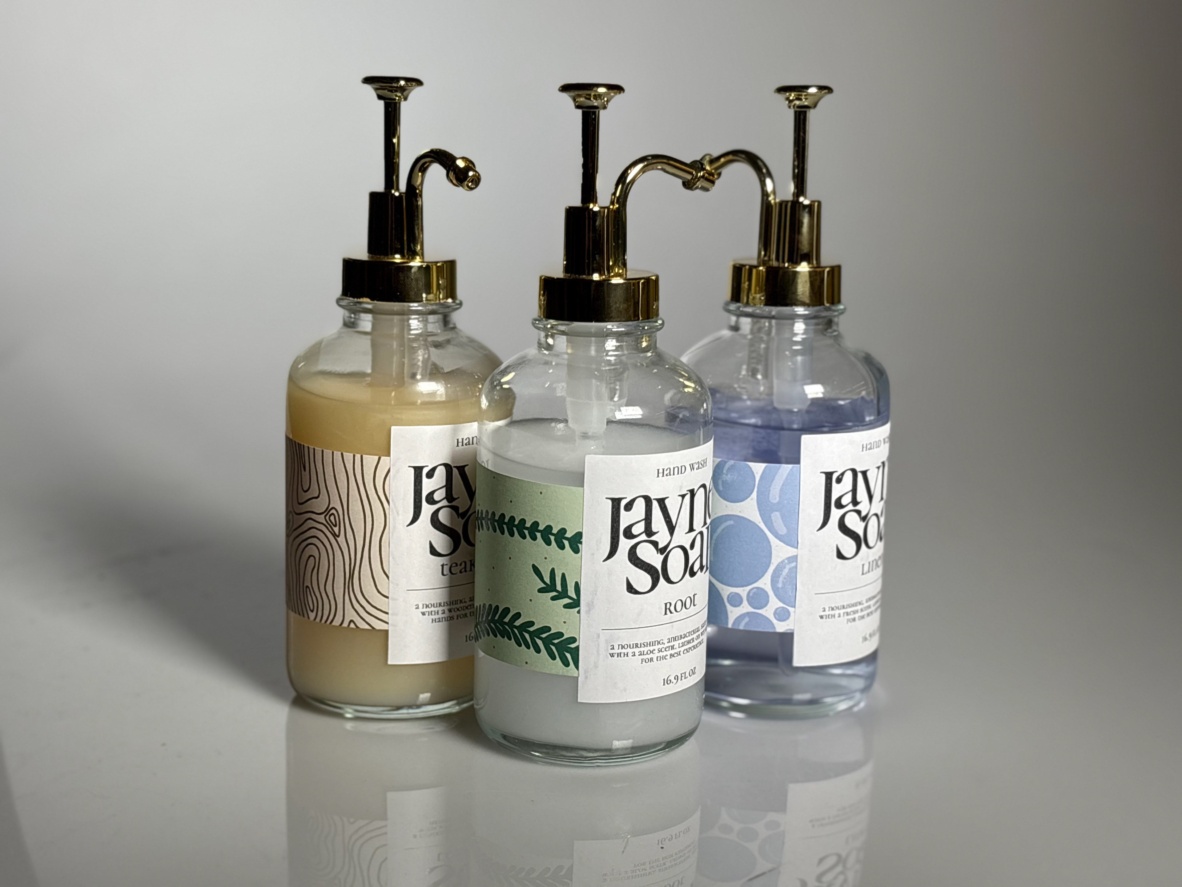
Jayne Soaps is a packaging design project that explores the balance between elevated aesthetics and playful personality within a functional product. The design maintains a clean, simplistic, and elegant structure, allowing the scents: Root, Teakwood, and Linen to be expressed through the bottle wrap. Each scent is visually represented with subtle yet distinctive graphic elements and color choices that reflect its essence: earthy and grounded tones for Root, warm and refined textures for Teakwood, and light, delicate visuals for Honeysuckle. This thoughtful integration of scent and design creates a cohesive system that feels both sophisticated and approachable, transforming the product into a refined yet engaging shelf presence.