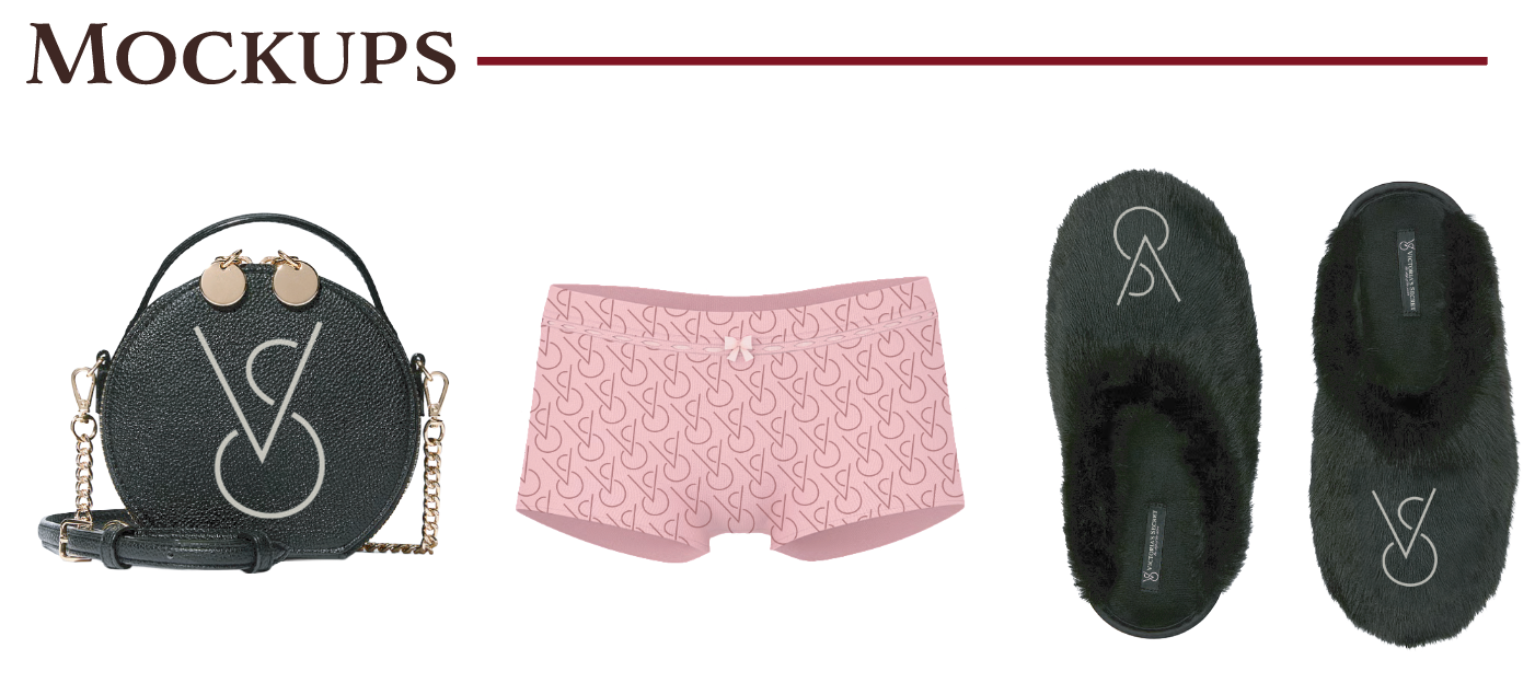

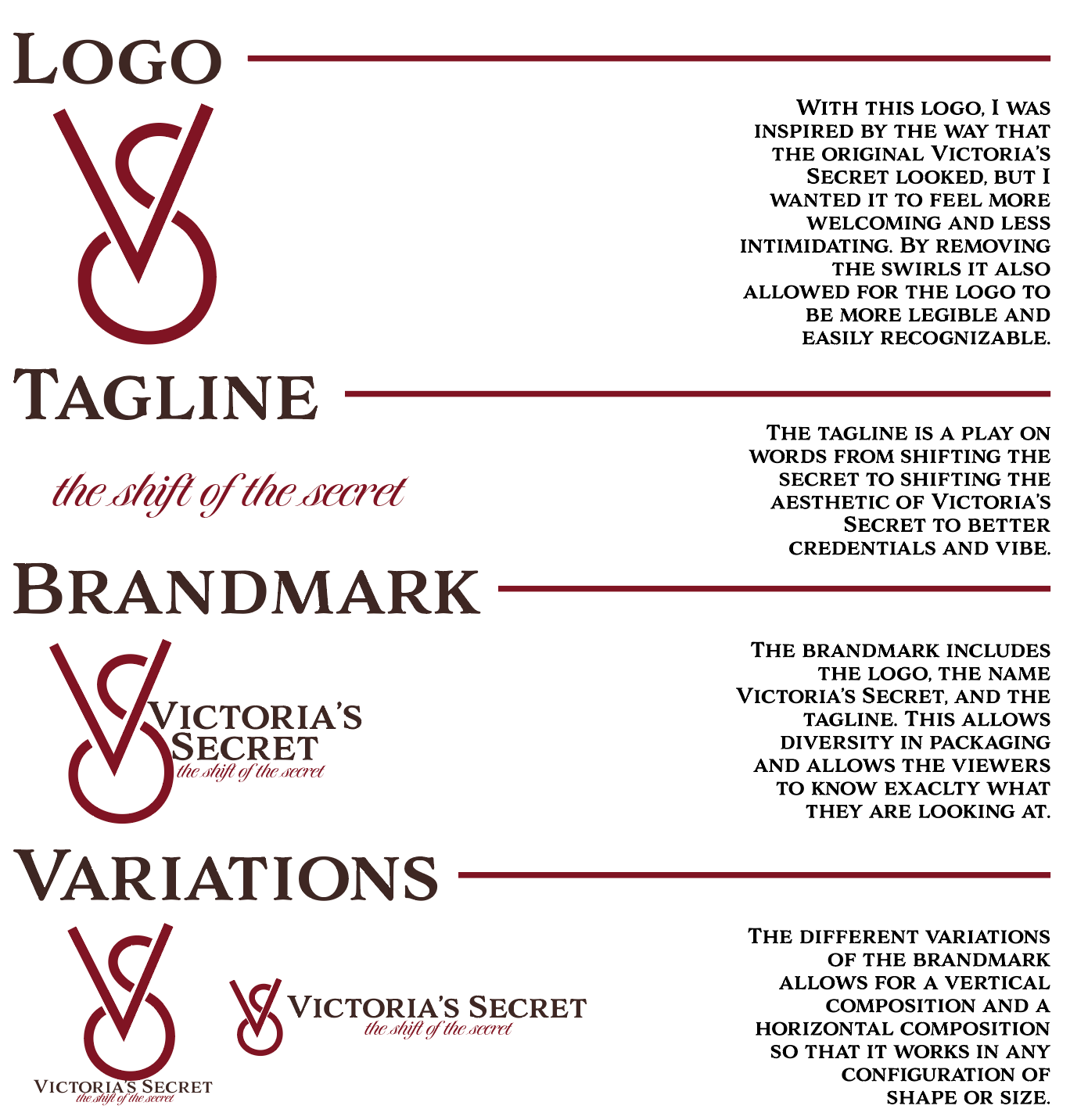
The rebrand of Victoria’s Secret reimagines the company as a more welcoming, inclusive, and approachable brand by shifting away from its historically exclusive and intimidating image toward one that emphasizes authenticity, comfort, and self-expression. Previously defined by hyper-glamorous visuals, narrow beauty standards, and a high-fashion, male-gaze-driven aesthetic, the new identity softens its approach through a modernized visual system that incorporates warmer neutrals, simplified typography, and more natural, relatable imagery featuring diverse body types, skin tones, and identities. This transformation extends beyond visuals into the brand’s tone of voice, which becomes more conversational and empowering, encouraging confidence without pressure or unrealistic expectations. Additionally, retail and digital environments are redesigned to feel more open and inviting through softer lighting, intuitive layouts, and a more relaxed atmosphere, helping to reduce the sense of intimidation often associated with the brand. Overall, the rebrand positions Victoria’s Secret as a company that celebrates individuality rather than perfection, aiming to foster stronger emotional connections and create a space where a broader range of customers feel seen, comfortable, and confident.
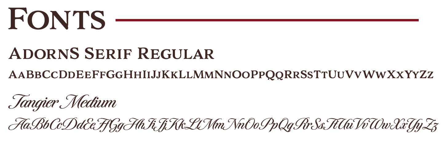
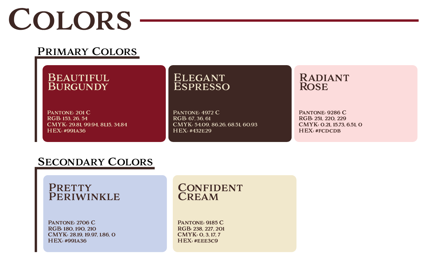
The design choices behind the Victoria’s Secret rebrand were centered on fundamentally reshaping how the brand communicates identity, comfort, and inclusivity through every visual and experiential touchpoint. The shift away from high-contrast, glossy, and hyper-stylized imagery toward softer lighting, natural posing, and candid photography was intentional in breaking down the “untouchable” aesthetic and replacing it with a more human, relatable presence. Color played a key role in this transformation, with warmer neutrals and muted tones replacing bold blacks and saturated pinks, creating a calmer and more inviting visual language. Typography was simplified and modernized to reduce visual tension and improve readability, reinforcing a sense of ease and accessibility across both print and digital platforms.
Beyond static visuals, layout and composition were redesigned to feel more open and breathable, using increased white space and balanced grids to avoid overwhelming the viewer and instead guide them gently through content. In physical retail spaces, this translated into softer lighting, less rigid merchandising structures, and more intuitive pathways that encourage exploration rather than pressure-driven shopping. On digital platforms, the interface was streamlined with clearer hierarchy and more conversational messaging, ensuring that users feel supported rather than marketed to. Together, these design decisions work cohesively to dismantle the brand’s previous exclusivity and rebuild it around authenticity, self-expression, and emotional comfort, positioning Victoria’s Secret as a more inclusive and empowering experience.